Portfolio 2 of 2: natural stone jewellery
Véra Helmina
Turning feeling, memory and atmosphere into wearable form. A jewellery maison shaped by places and by saudade, the quiet longing for moments, places and versions of ourselves that stay with us.
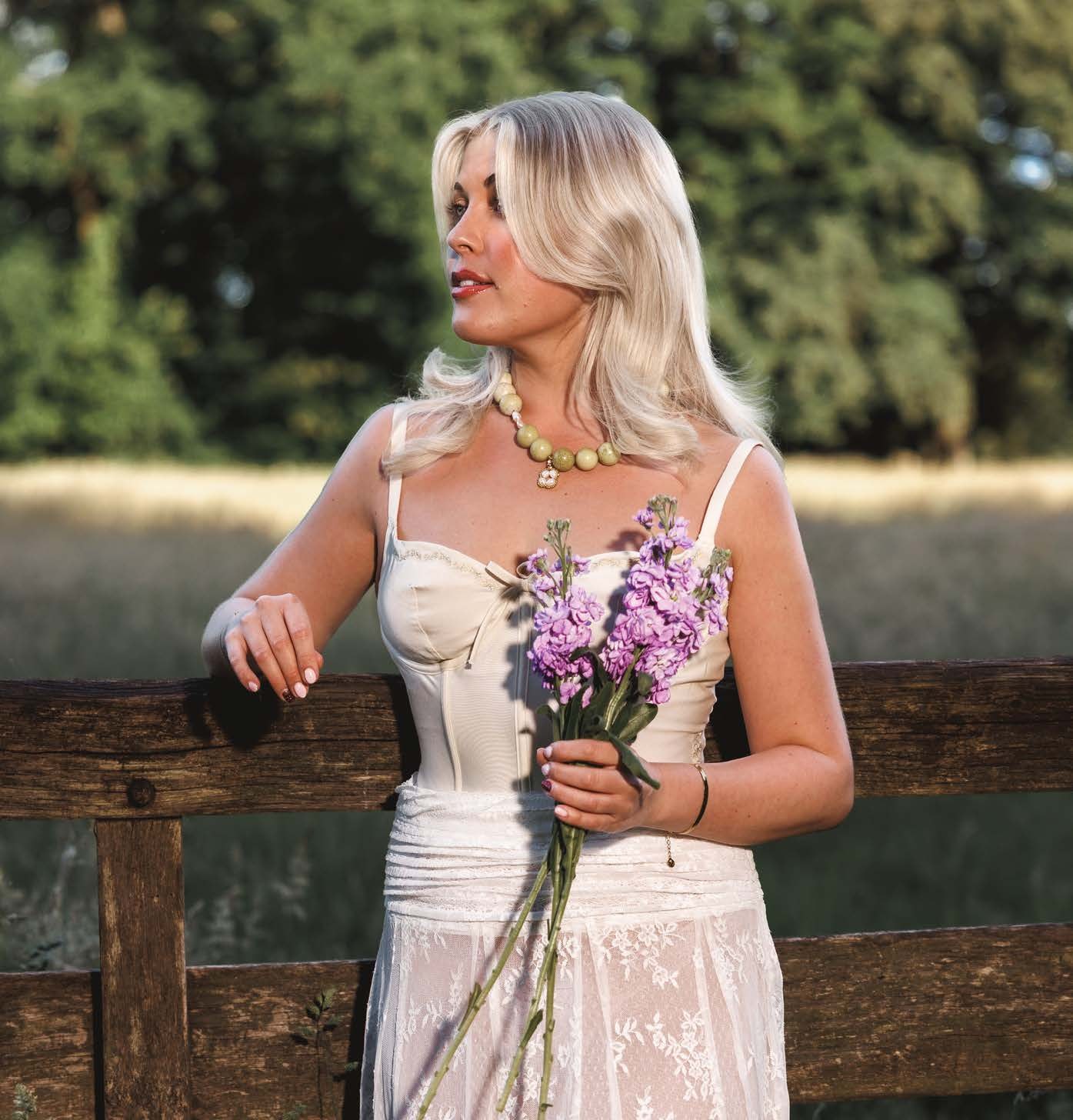
- What I created
- Concept, brand story, art direction and content, as founder
- Year
- 2026, the debut collection
- Category
- Natural stone and freshwater pearl jewellery
- Result
- 15-page brand book, first photoshoot, jewellery imagery, two educational social series
01
The word saudade as a foundation for the brand
I learned the Portuguese word saudade during my exchange year in Brazil, long before I understood how much it would shape me. Over time it became a way of feeling the world: a thread connecting the places I have lived, the people I have met and the atmospheres that stayed with me.
A bittersweet longing for someone, somewhere or something meaningful that is absent, remembered or cannot be experienced in quite the same way again.
“Learning Portuguese taught me what saudade means: the bittersweet beauty of longing for moments, places and people.”
From the founder’s letter
From a feeling to a brand brief
The task was to turn an abstract feeling into a jewellery brand people can recognise, wear and connect with. I treated atmosphere as the starting material: the warmth of terracotta, the colour of water, the light of a particular city. Each became a reference point for the strategy, the stones, the art direction and the photography that followed.
02
Strategy and positioning: jewellery as a small relic of a place
Each piece begins with a landscape and its colours, and becomes a small relic of a place, a feeling or a moment.
- Concept
- Jewellery as memory, colour as geography, emotion as material.
- Places in the first edition
- Lisbon’s aqua tides and terracotta warmth. Porto’s gold shadows and burgundy depth. The protective fire of red jade.
- Vision
- To translate atmospheres into wearable poetry, creating jewellery that carries the emotional resonance of colour, memory and saudade.
- Mission
- To craft meaningful pieces from natural stones, pearls and evolving precious materials, holding what we long for, remember and keep close.
- Audience
- “For those who collect moments, not things.” People who feel deeply and move through the world guided by colour and atmosphere.
- Positioning
- Not adornment, but a talisman: “saudade, made wearable.”
03
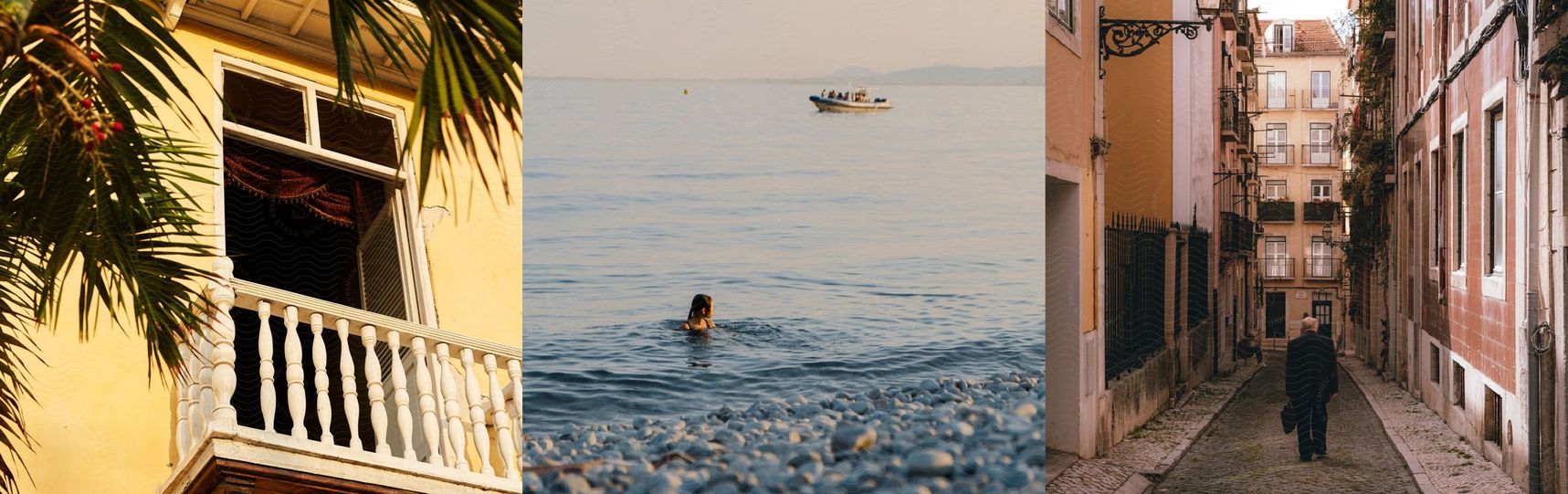
Art direction: coastal light, water and warm stone
Soft coastal light, warm sand tones, deep brown shadows and soft ocean blue form the visual foundation. The mood is intimate, contemplative and atmospheric: a blend of longing, elegance and subtle storytelling.
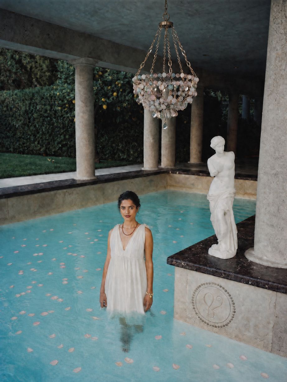
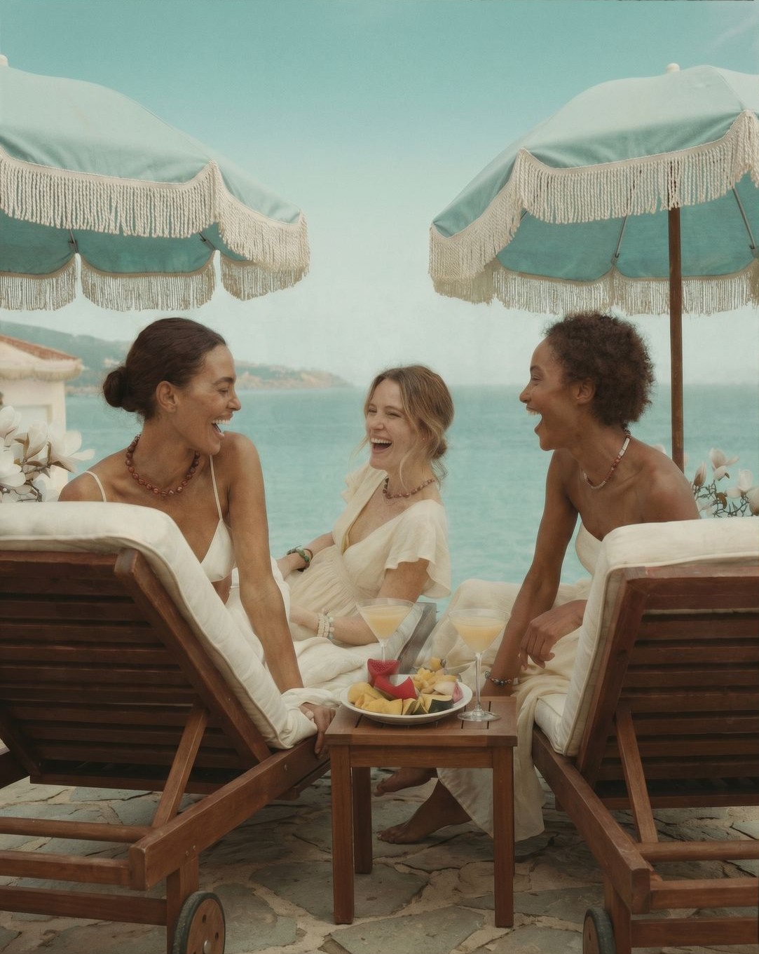
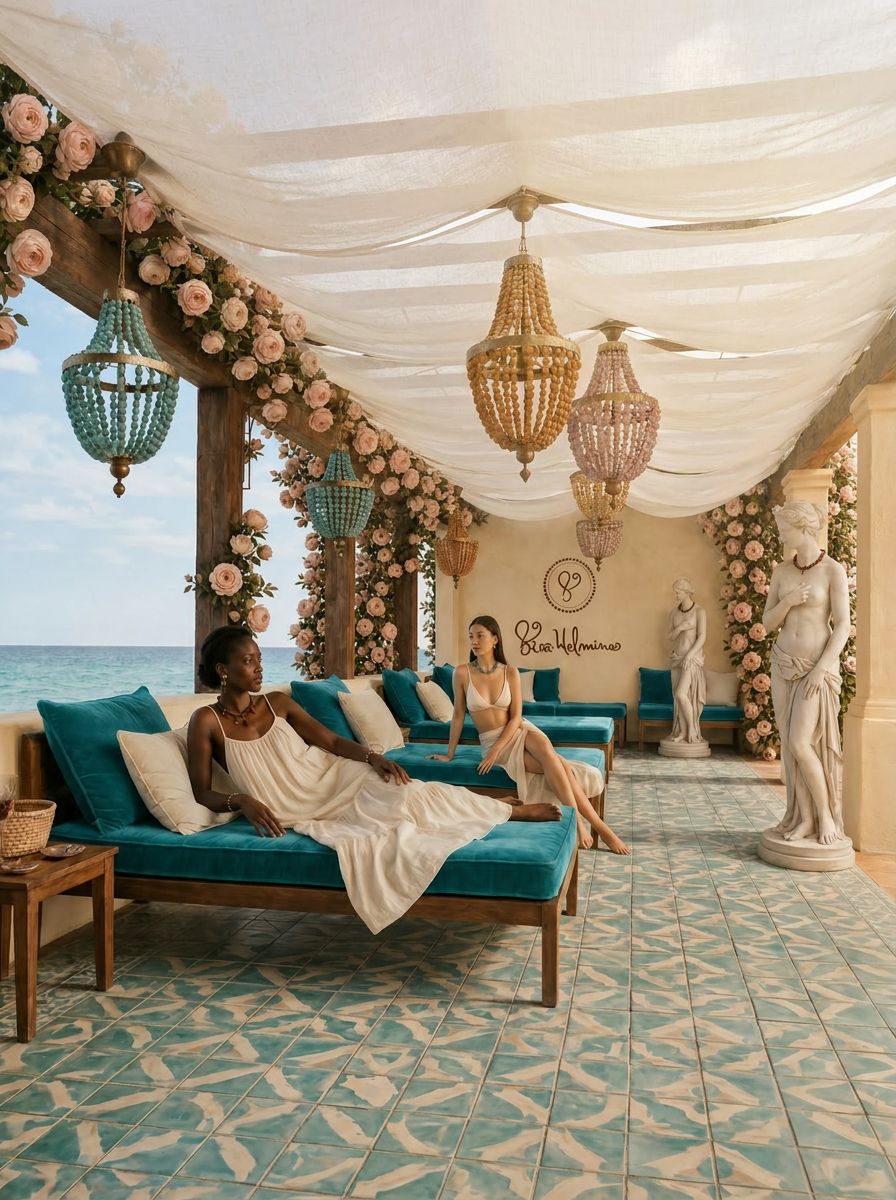
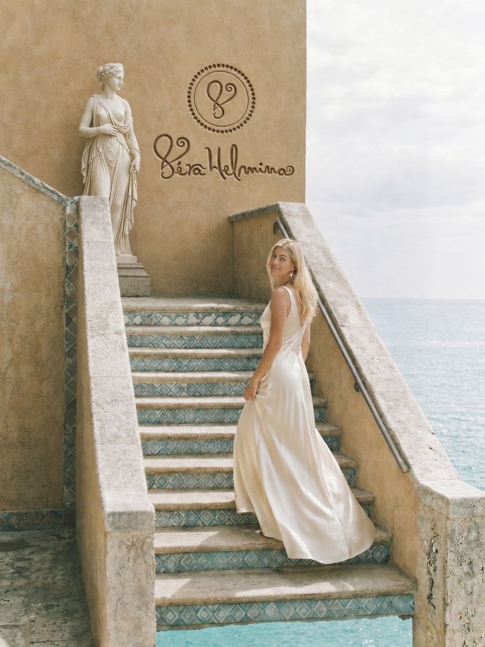
- Lisbon aqua
- Terracotta
- Porto gold
- Burgundy
- Warm sand
04
Identity: a handwritten wordmark and six values
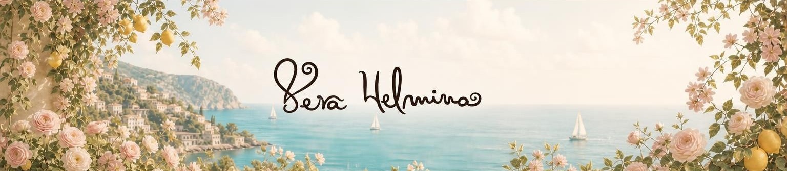
The wordmark is a flowing script, paired with a light, clean sans-serif (Source Sans) in the brand book: handwritten intimacy balanced with calm clarity.
Six values guide every piece
- Emotion over ornamentEvery piece begins with a feeling, not a trend.
- Atmosphere as identityColour, light and place guide the creative direction.
- Intention in every detailSlow, thoughtful craftsmanship over urgency.
- Honesty and simplicityClarity, calm and quiet depth define the aesthetic.
- Meaningful materialsStones, pearls and precious metals chosen for resonance, not excess.
- The talismanicJewellery as a companion to memory, longing and the in-between.
05
Product development: natural stones, pearls and gold-touched details
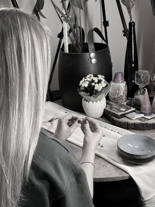
The debut collection uses natural stones and freshwater pearls held together with gold-touched details, grouped into colour stories. As the maison evolves, the plan is to move into 18K gold and sapphires, while the essence stays the same: every piece a fragment of place and a trace of time.
Select a piece to see it up close. See all twelve pieces
06
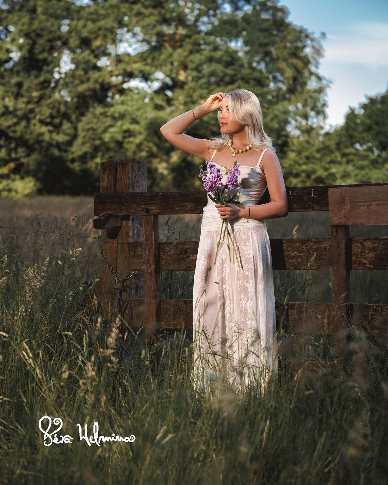
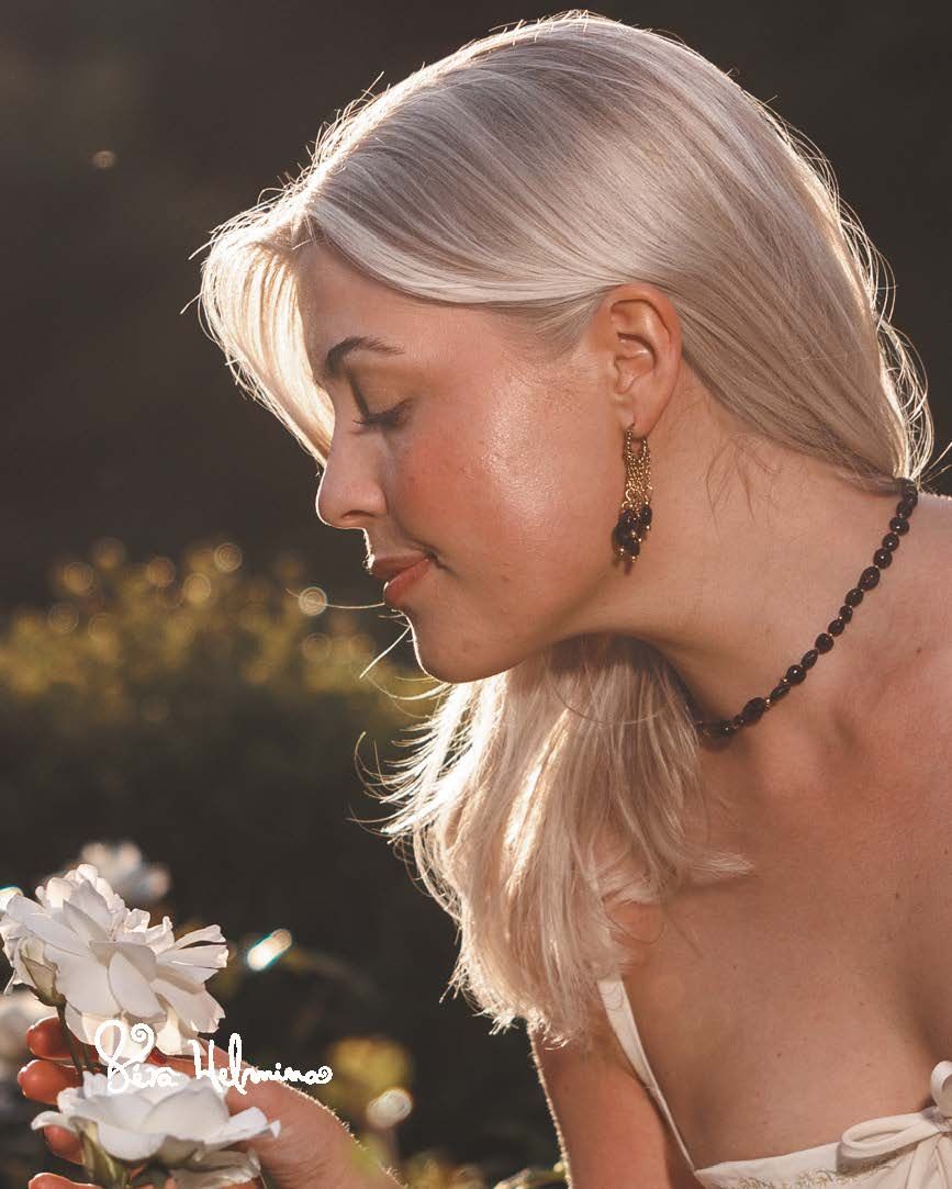
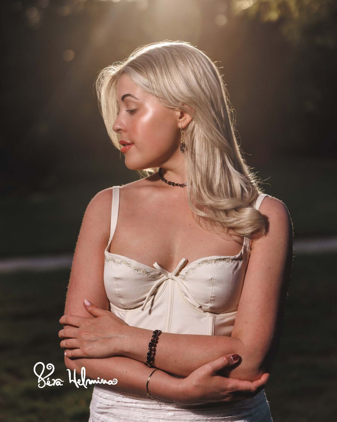
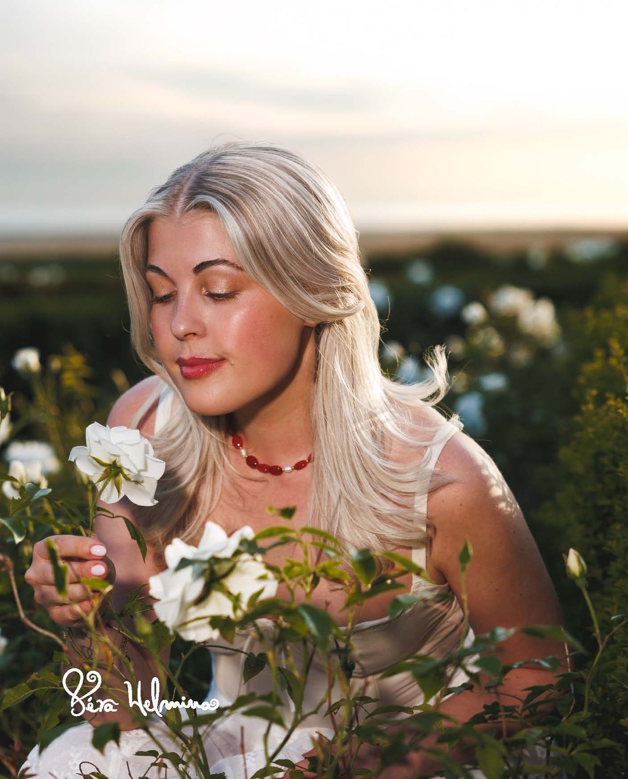
Photography: bringing the debut collection to life
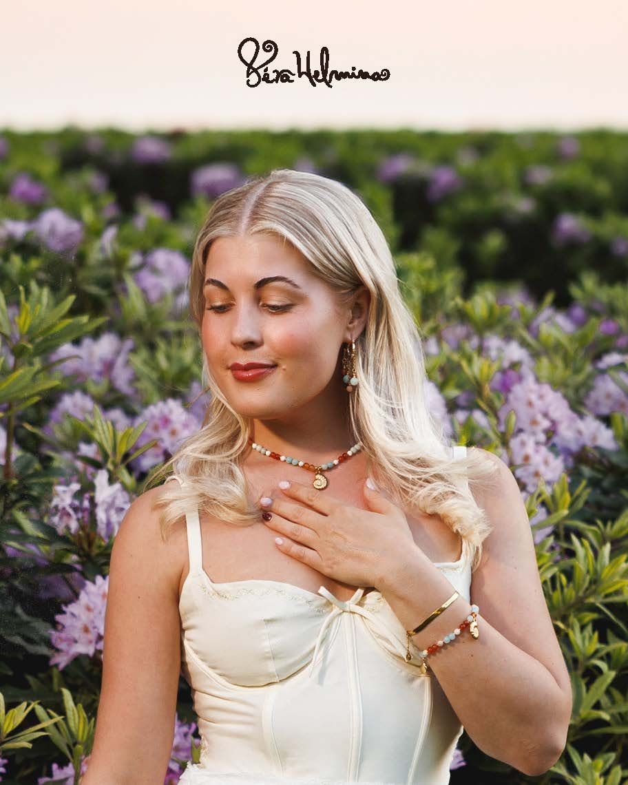
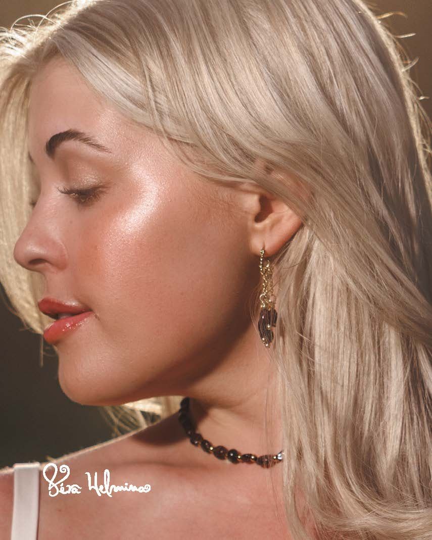
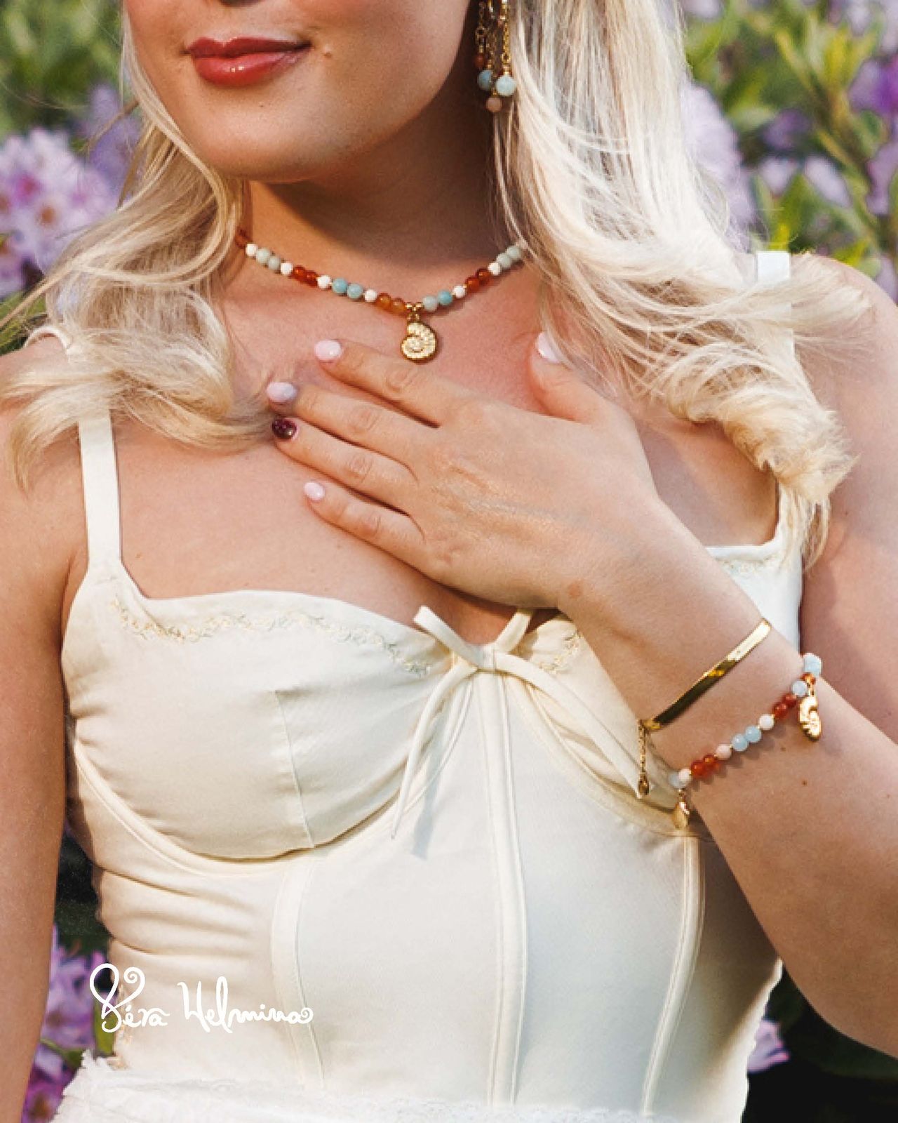
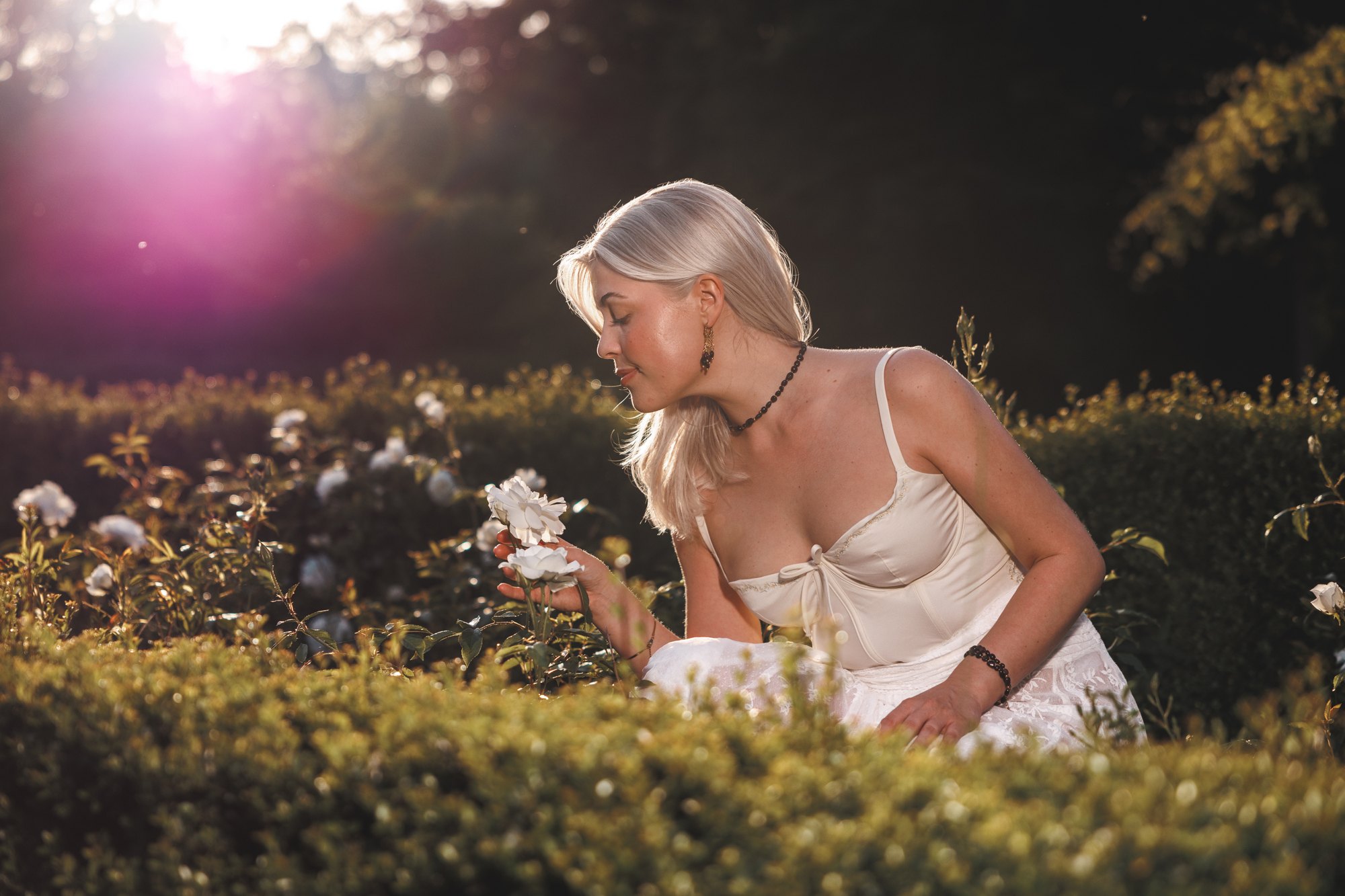
The art direction became the brief for the first photoshoot: golden hour, flowers and soft natural light, with the pieces worn close to the skin. I modelled the pieces myself.
08
Outcome and what I learned
Véra Helmina grew from a personal archive of impressions into a cohesive brand world, with a clear point of view and a plan for slow, intentional growth.
What came out of it
- A 15-page brand book: vision, mission, mood, the atelier, plans, the meaning of saudade, brand story, philosophy, manifesto, values and founder’s letter
- A first photoshoot of the debut collection
- Product and still-life imagery
- Two educational Instagram carousel series
What I learned
An abstract feeling becomes a brand once it has rules: a palette, places, values and a voice. Defining those for saudade gave every later decision a reference point, and showed me that my sensitivity to atmosphere is most useful when it is paired with structure.
07
Content strategy: educational carousels that build authority
To build authority around pearls and heritage jewellery, I created educational carousels for Instagram. They pair archival imagery with an editorial typographic voice, so the brand earns attention by telling stories.
Before diamonds, there were pearls
One five-slide carousel: from the oldest known gem to Chinese emperors and “the most expensive dinner in history”.
The secret behind every luxury pearl necklace
Four slides on the silk knot: why it protects each pearl and makes a strand last for generations.